Graylog widgets offer a powerful way to visualize data and create meaningful dashboards. Widgets provide new perspectives on data because they primarily represent aggregated data, like a widget that displays firewall log data providing you valuable information about failed attempts to infiltrate your system within the last 24 hours. This information, displayed in a graph or bar chart, can give you a better understanding of your environment at a glance.
In this article, we will explore the different widget types, how to create new widgets, and how to configure widgets to suit your desired results.
Widget Types
There are primarily two types of widgets you can employ to visualize your data:
A third widget type is available, which you can use purely to add information to a dashboard:
Pre-Defined Widgets
Widgets can be configured manually, or you can choose to make use of pre-defined widgets. These widgets have pre-defined metrics that you can optionally add to. Here is a list of predefined widgets that you can find on the side bar of the Search page, by clicking the + icon:
-
Log View: Presents log data in a format similar to common log format with timestamp, source and message fields predefined.
-
Message Count: The message count widget displays the total number of log messages that match the specific search criteria over a time period that you determine. This widget is commonly used to monitor log volume trends and get quick, high-level insights into log activity. The message count widget is predefined with the Count function and Single Number visualization.
Aggregation Widgets
An aggregation is a collection of data that has been grouped and organized meaningfully to provide an answer to a question you have about your data. This approach allows you to focus on the desired fields, functions, or metrics you want to know more about.
Aggregation widgets enhance this process by offering tools for organizing, visualizing, and interpreting search results from various perspectives. Aggregation widgets allow you to group data, apply metrics, and sort fields (e.g. ascending or descending) to reveal meaningful insights. For example, if you want to see which page on your website takes the longest amount of time to render, you can aggregate on the took_ms field and sort the results in descending order to determine the answer.
These widgets support features like showing the top values for quick data discovery and various visualization options to make data clearer. They are especially useful in dashboards, enabling side-by-side comparisons of multiple queries on the same page.
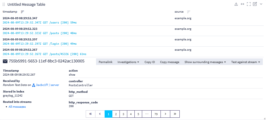
Message Table Widgets
A message table widget displays messages and their fields. Below you see a message table widget that displays messages with their timestamp and source fields. These widgets allow for a more granular examination of individual messages. Message-level searches are crucial for investigations and any time you need detailed information.
You may also see the detailed view of a message with all its fields by clicking on a message row. All fields in a message can be added to the table as a column through the configuration menu.
Text (Markdown) Widget
The Text (Markdown) widget displays formatted text on a dashboard using Markdown syntax. Use this widget type to document the dashboard’s purpose, add instructions, or include other relevant information.
Use standard Markdown formatting to add:
-
basic text
-
headings
-
links
-
lists
-
tables
-
images
For help with Markdown formatting, see the Markdown Guide.
Just like other widget types, you can resize the widget, and you can place the widget in the dashboard wherever it makes sense.
Create a New Widget
You can create a new widget after running a search. As widgets are visual representations of specific sets of data, you define the data you want to see in the widget by executing a search for that specific set of data. Once you have executed the search successfully and defined any filters and parameters as needed, complete the following steps to create a new widget on the search page:
-
Click Create
+in the sidebar. -
Select one of the following based on your desired widget output:
-
Generic: Adds an empty aggregation or text widget.
Hint: Note that parameter is an option under the Generic category. However, this option refers only to adding a parameter to your search and is not a widget type. -
Predefined Aggregation: Select from Log View, Message Table, or Message Count.
-
Investigations Overview: Adds a widget that includes all active alerts and investigations. This widget comes with default columns and sorting. It can be modified via the configuration menu.
-
Events Overview: Adds a widget displaying all events and event definitions. This widget comes with default columns and sorting. It can be modified via the configuration menu.
By default, creating a new widget from the search page will populate the search page with that widget. This can be helpful for temporarily visualizing your search results or if you want to keep your widget on the search page. Ultimately, widgets are most useful and can be readily shared when added to dashboards. To add your widget to a dashboard select Copy to Dashboard from the drop-down menu in the widget, and select the appropriate dashboard. For more information on dashboards, see the Dashboards documentation.
Configure a Widget
After you create a new widget, click the pen icon in the top right corner of the widget to modify its configurable properties. Depending on the type of visualization you have selected for your widget, there will be a number of settings available to you:
Widget-Specific Search Criteria
Widget-specific search criteria are search queries, parameters, and filters applied to logs that determine the specific set of log data a widget will display.
Within the configuration menu for the specific dashboard widget you have selected, a search bar will appear at the top. This is where you can run a query for data that will be included in the widget. Additionally, you can apply search filters and search parameters to this query as needed.
Group By
This option allows you to group your chart by rows and columns. The data points of a field will be aggregated to a selected row or column. For example, the avg() function can find the average of numeric data points of took_ms in the column.
When you create a new group using Group By, the values you select get rolled up into the result. This result can be presented in a variety of ways, like a table, chart, or color-coded.
For example, if the field timestamp is attributed to a row, it will divide the data points into intervals. Otherwise the aggregation will take up to fifteen elements of the selected field by default and it will apply the selected metrics function to the data points. If timestamp is aggregated with avg() on took_ms, the column action will give the average loading time for a page per action for every 5 minutes.
Metrics
Metrics are specifications or quantitative measurements that help you find answers; they help you gain more detailed insight into your data by putting it into context. A metric may give you the average amount of time spent downloading a page or a comparison of sales made in several countries.
Metrics can be determined by selecting a function and a field to aggregate on from the drop down menus in the widget configuration modal. You can use metrics to obtain a numerical result. For example, sum counts bytes for all matched messages for the given time. If you have a bar chart organized by time, it will give you an idea how much data is pushed into storage over a defined time period.
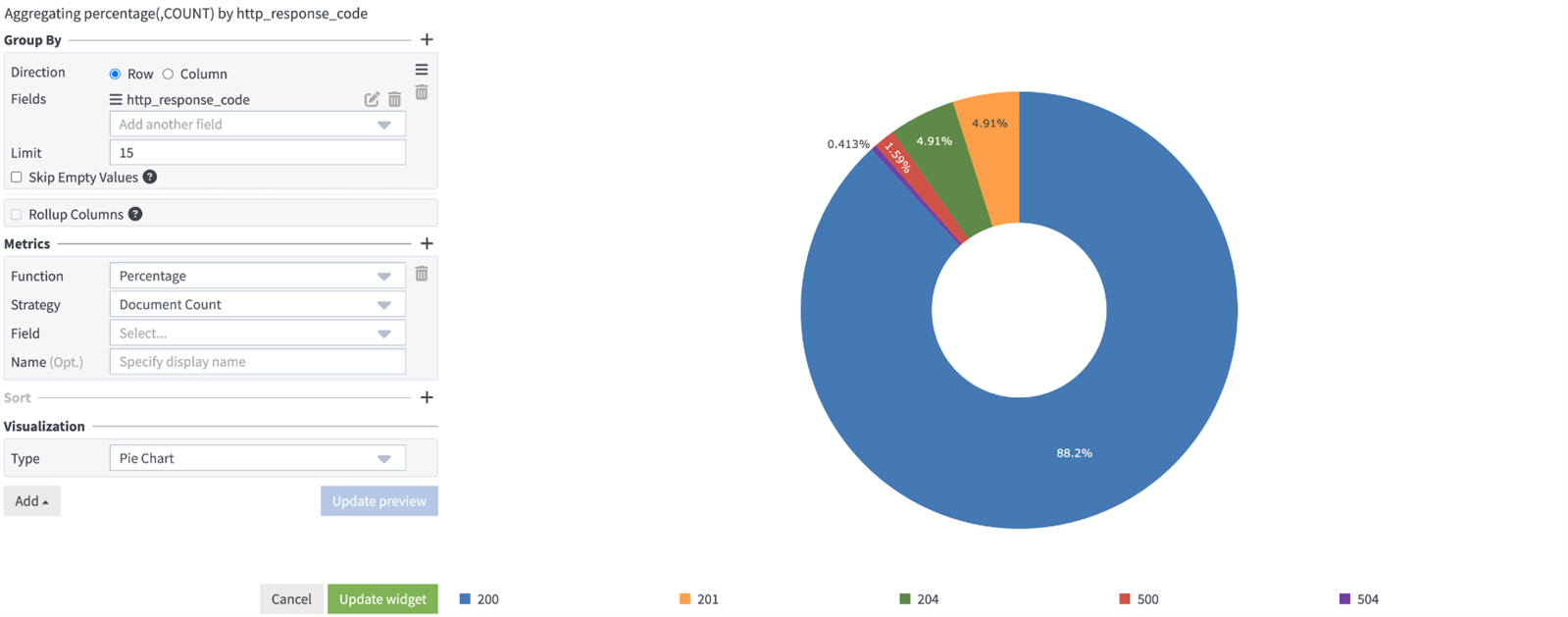
The Percentage Metric
The percentage metric helps to display results in the form of percentages instead of raw numbers. In some cases, percentages are easier to read and provide better insight into results. Results can be represented as percentages in bar charts, pie charts, and message tables. To apply the percentage metric, for the Function field in the configuration menu, select Percentage.
To understand the application of the percentage metric, we can look at a use case. In this example an analyst wants to understand which controllers are receiving the most amount of calls and how much difference there is between each one. They could quickly reach an opinion by viewing a comparison of the percentage of calls over controllers in a chart like the one below. Here the count metric displays the number of messages received from three different message controllers.
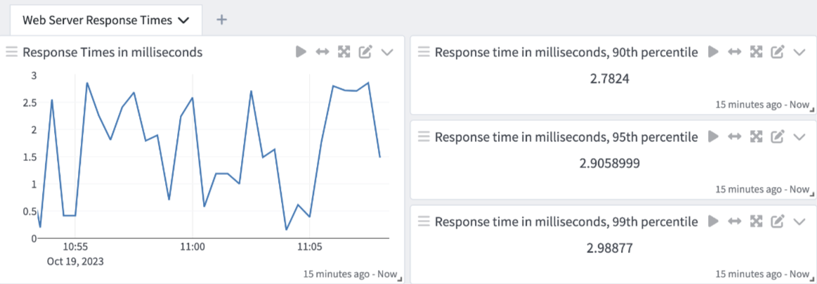
The Percentile Metric
The percentile metric helps to display the percentile or the relative standing of a certain value compared to the total. To apply the percentage metric, for the Function field in the configuration menu, select Percentile as the function. You may then select the field you are looking for along with a percentile value from the drop down menu.
We can also look at a use case to highlight the value of the percentile metric. In this example an analyst has a web server application that reports its response times as GELF messages that are ingested by Graylog. They wish to understand the application’s 90th, 95th, and 99th percentile response times. These response times could be noted as the normal range.
Sorting and Direction
The order of result values can be configured in this section. Sorting defines what field drives the sorting of data, and Direction determines whether it will be ascending or descending.
-
Interpolation: The area chart and line chart support different interpolation types. Interpolation is the action of deducing between two data points. You can select how you would like to interpolate by selecting one of the available interpolation types under Visualization: Linear, Step-after and Spline.
-
Event Annotations: All visualizations that can display a timeline (i.e. area chart, bar chart, line chart, scatter plot) support event annotations. Each event will be displayed as an entry on the time axis.
Visualization
A graph view can often make it easier to compare a large volume of results. For example graphs can clearly display large spikes in web traffic. Such visual displays can attract attention and help analysts to notice and respond to these events rapidly.
Graylog offers a multitude of visualization types, such as area charts, bar charts, heat maps, and world maps. Choose a visualization type based on the type of data you are working with.
Decorators
Decorators allow you to alter message fields while preserving the unmodified message, which can allow you to alter the way message fields are displayed in widgets. Decorators are especially useful in making the data in your fields more readable, combining data in a field, or adding new fields with more information about the message.
See our documentation on Decorators for more details.
Filters
The filter configuration option is available for Events Overview and Investigations Overview widgets. This option does not refer to search filters, which may be modified in widget specific search criteria. This refers to specific ways in which you may further filter the data presented in these widgets. For example, you may choose to filter investigations by assignee or to filter events by event definition.
Modify Widgets with the Value and Field Action Menus
Value action menus and field action menus allow you to perform quick actions like removing a field from all tables or creating a new widget with all field values presented in a data table. You can also choose to highlight field values across all data tables. When you click a value or a field within a widget, you will see a drop-down menu. You can execute any displayed actions by clicking on them. See below for a full list of available field and value actions.
Field Actions
Various field actions are displayed based on field type and location whenever a field name (not its value) is selected.
-
Chart: This will generate a new widget containing a line chart where the field's average value is displayed over time. This chart can be taken as a starting point for a more defined aggregation. This is only possible in fields that are numerical.
-
Show Top Values: This action will generate a new widget containing a data table where the field values are listed in rows and the number of occurrences will be displayed next to it.
-
Statistics: Here field values are given to various statistics functions depending on field type. The result will be displayed in a data table.
-
Add to Table: Add the field to the displayed fields of the message table where the Field Actions menu is shown.
-
Add to All Tables: Add the field to the displayed fields of all tables.
-
Remove from Table: Remove the field from the list displayed fields in this table.
-
Remove from All Tables: Remove the field from the list displayed fields in all tables.
-
Copy Field Name to Clipboard: Copies field name to clipboard.
-
Change Field Type: Change the field type for a specific field.
Value Actions
Value actions produce different results depending on the type of value and where the menu is opened. The following actions can be executed:
-
Insert into Dashboard/Search: Passes the value to the selected dashboard or saved search and used as a parameter.
-
Exclude from Results: Will add to the query to exclude all results where the field contains the value of the value action.
-
Add to Query: Will add
NOT field:valueto the query to filter the results additionally for where the field has the value of the value action. -
Use in New Query: Will add
field:valueopen a new view tab with a query string. -
Show Documents for Value: This is available in data tables. It will display documents that were aggregated to display this value.
-
Highlight this Value: This action will highlight this value for this field in all message tables and data tables.
-
Create Event Definition: Create an event definition based on the value. See Create an Event Definition Directly From Search Results for details.
Determine Unit Settings
Unit type determines which units are offered. If you select Size as the field type, you are presented with sizing units such as byte, kilobyte and megabyte. The unit settings configuration option is available for most numeric fields and metric functions.
gl2_ prefixed fields. Only modify a predefined unit if you are sure that it is incorrect or if you do not want to view unit values in the widget.
Each selected unit type is represented with an axis. Multiple fields with the same unit type can be displayed on the same axis. If you select to view a field with unit type size and another field with unit type time, an axis is displayed for each unit type. There are four available axes: number, size, time, and percentage.
Graylog converts units for most visualization types. If you hover over a value in a widget display, you see the converted unit value. With Data Table, you can see the original field unit value when you click on the drop down arrow to the right of the converted value.
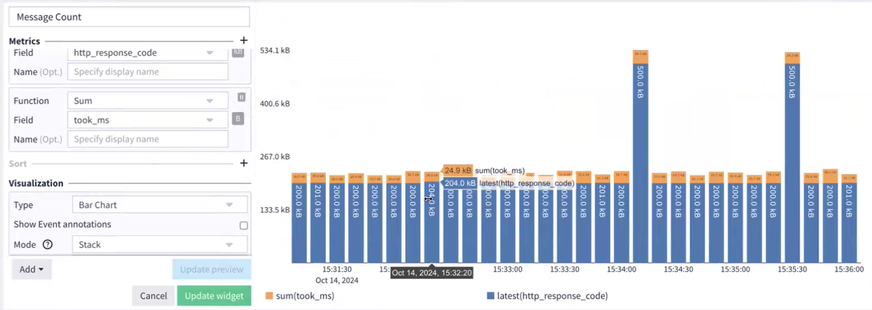
In the image below, field values are grouped by unit type. The Mode is Stack, so the two fields with the same unit type are stacked on top of each other. If you select Overlay, you see one field layered over the other.
Modify Field Unit Settings
If you wish to modify field unit settings:
-
Click the Edit icon (pen) found in the top right corner of the widget.
-
Locate the desired field in the widget configuration menu.
-
Click the icon found to the right of the desired field.
-
Select unit type and the unit in the modal that appears.
-
Click Update preview if you wish to preview the changes you made.
-
Click Update widget.
You can now view the converted values in the widget display.
Review Field Unit Values
Graylog converts field unit values to display the best outcome in a widget view. Search results can include messages with field unit values that are not easy to understand or display. Graylog formats large numbers or numbers with multiple digits to make them easier to understand. For example, if ingest_time is set to nanoseconds, Graylog converts this value to seconds to achieve a readable number. Graylog also modifies field unit values to display only one decimal place by default.
Graylog converts field unit values to allow for an accurate comparison between fields. In some cases, a widget can include multiple fields with the same unit type (e.g. size) but different units (e.g. kilobytes and megabytes). Graylog formats these values to make sure that the comparison is made between fields with the same units.
Manage Widgets
Widgets can be duplicated or deleted by clicking the chevron in the top right corner. You can also add widgets to a list of existing dashboards or place one in a new dashboard by selecting the Copy to Dashboard check box.
Widgets can also be freely placed inside the search result grid. You can drag and drop them by clicking and holding the three lines to the left of the widget name. You can resize them by using the gray arrow in the bottom right corner. To expand a widget to full grid width, click the arrow in its top-right corner.
If you want to expand the view of aggregated data in your Log View widget, see Log View Widget.
AI Widget Summaries
Widget summaries introduce natural language summaries to Graylog widgets through an AI service. You can generate a plain-language summary for any aggregation widget directly in a dashboard containing the widget. The summary is based on the data visible in the widget and contextualizing information provided by you.
This feature helps you interpret dashboards quickly, highlight trends, and describe findings without manually explaining metrics or charts.
Enable AI Widget Summaries
AI feature services are enabled by default. To change this configuration, navigate to System > Configurations > Plugins > AI Feature Services and select Edit Configuration.
Generate AI Widget Summary
To generate a new AI summary:
-
From the dashboard containing the widget you wish to summarize, select Generate Widget Summary from the top left dashboard tool menu. If this is unavailable, AI features may be disabled globally or your account lacks adequate permission.
-
If this is the first summary you have enabled, you will receive a disclaimer providing the terms of service. If you wish to proceed, you must accept the disclaimer.
-
From the Adding more context to Widget menu, fill out the modal with information that helps the AI interpret the widget’s contents. In the Description field, briefly describe what the widget displays. In the Context field, indicate the insights or analysis you want the AI to focus on. Providing relevant context improves the accuracy and usefulness of the generated summary.
-
Select Run to proceed. The summary appears in a panel on the right side of the dashboard.
-
Be sure to select Save on the dashboard.